


Übersicht des Verlags / Overview from Publisher
"Carmers Kunstanstalt Dortmund (Cekade)"
| Postkarten auf Karte / | |
| Cards on Map |
Layouts & Logos © Cramers Kunstanstalt, D-Dortmund, ab/since 1997 schoening-verlag.de
| # | Verlags- nummer / Number from Publisher |
Jahr / Year | Vorderseite / Front | RŁckseite / Back | Anmerkungen / Remarks |
| #1 | Sal 865 & andere/others | ~1989 - ~1996 |  |
 |
"Cekade" Vermutlich erstes Design vom 1900 gegrŁndeten Verlag Cramers Kunstanstalt aus Dortmund - typisch ist die Schriftart "Brush Script"./
Probably the first design by the publishing house Cramer's Kunstanstalt from Dortmund, founded in 1900 - typical is the font "Brush Script".
Vermutlich erstes Design vom 1900 gegrŁndeten Verlag Cramers Kunstanstalt aus Dortmund - typisch ist die Schriftart "Brush Script"./
Probably the first design by the publishing house Cramer's Kunstanstalt from Dortmund, founded in 1900 - typical is the font "Brush Script". "Cekade" steht fŁr die drei ausgesprochenen Anfangsbuchstaben / "Cekade" stands for the three in German pronounced initial letters C K D = Cramers Kunstanstalt Dortmund. 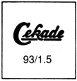 Unter "Cekade" ist immer das Jahr der VerŲffentlichung, sowie die Auflage in Tausend angegeben - z.B. "93/1.5" = 1993 mit 1500er Auflage. Einige Karten wurden Łber die Jahre erneut verŲffentlicht./
Below "Cekade" always the year of publication, as well as the edition in thousands is indicated - e.g. "93/1.5" = 1993 with 1500 edition. Some cards have been republished over the years.
Unter "Cekade" ist immer das Jahr der VerŲffentlichung, sowie die Auflage in Tausend angegeben - z.B. "93/1.5" = 1993 mit 1500er Auflage. Einige Karten wurden Łber die Jahre erneut verŲffentlicht./
Below "Cekade" always the year of publication, as well as the edition in thousands is indicated - e.g. "93/1.5" = 1993 with 1500 edition. Some cards have been republished over the years. Die RŁckseiten aller Karten von Cramers sind identisch. Sie tragen auch das Logo "Die Qualitštsansichtskarte" (wie einige andere Verlage auch)./
The backs of all cards from Cramers are identical. They also bear the logo "The Quality View Card" (as do some other publishers).
Die RŁckseiten aller Karten von Cramers sind identisch. Sie tragen auch das Logo "Die Qualitštsansichtskarte" (wie einige andere Verlage auch)./
The backs of all cards from Cramers are identical. They also bear the logo "The Quality View Card" (as do some other publishers).Die Nummern bestehen aus Buchstaben und Ziffern. FŁr jede Stadt gibt es eine AbkŁrzung, meist der Anfang, manchmal noch der letzte Buchstabe. Danach wird fŁr diese Stadt durchnummeriert: / The numbers consist of letters and numbers. For each city there is an abbreviation, usually the beginning, sometimes also the last letter. After that is consecutively numbered for that city: "Sal" = "Salzgitter" / "Han" = "Hameln" |
| #2 | Dod 524 & andere/others | 1989 - 1997 |  |
 |
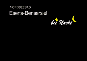
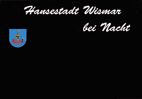
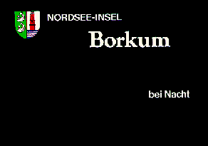
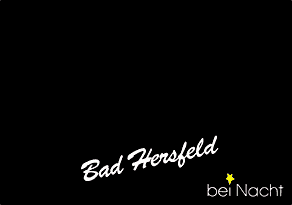
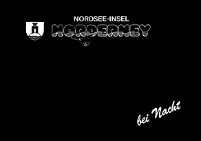
Ein weiteres Layout, welches fŁr viele Orte verwendet wurde hat einen Stern als i-Punkt und der Mond hinter dem t beim Text "bei Nacht".
Der Ortsname ist meist pink, gerade oder schršg, "bei Nacht" weiŖ etwas darunter oder am unteren Rand der Karte - beide wieder in "Brush Script".
/
Another layout that was used for many locations has a star as the dot on the "i" and the moon behind the "t" in the text "bei Nacht".
The location name is usually pink, straight or slanted, with "bei Nacht" in white slightly below it or at the bottom of the card - again in font "Brush Script".
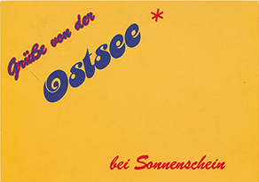
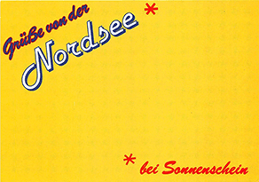
FŁr Nord- und Ostsee oft mit Zusštzen und meist weiŖem Ortsnamen in anderen Schriftarten. Selten sind Verzierungen ergšnzt. / For North and Baltic Sea region often with additions and mostly white place name in different fonts. Ornaments are rarely added. 

 Bei der Neuauflage der Karte von Wangeroge wurde 1997 "bei Nacht" auch in gelb gedruckt: / In the new edition of the card of Wangeroge in 1997 "at night" was also printed in yellow: 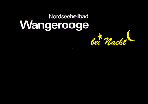 Bei der Karte von Kappeln fehlt der Mond, bei der von Wisbar Stern und Mond, und bei der von Borkum ist "bei Nacht" gšnzlich anders: / The card of Kappeln lacks the moon, the one of Wisbar star and moon, and the one of Borkum "at night" is completely different: 
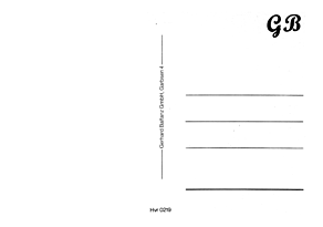
 Bei den Karten von Haspe und Bad FŁssing ist der lokale Distributor mit aufgedruckt. Die Karte von Hannover wurde (wie andere Ansichtskarten von Hannover) fŁr den Verlag Gerhard Balfanz hergestellt: / The cards of Haspe and Bad FŁssing have the local distributor printed on it. The card of Hannover was produced (like other postcards of Hannover) for the publisher Gerhard Balfanz: 


 Siehe ‹bersicht / see overview, die auch Designs von der "Kunstanstalt Edmund von KŲnig" enthšlt, die auch den "bei Nacht" mit Stern und Mond etwa zur gleichen Zeit verzierte./ which also contains designs from the "Kunstanstalt Edmund von KŲnig", who also decorated the "bei Nacht" with star and moon around the same time. |
| #3 | Det 645 & andere/others | 1990 - ~1995 |  |
 |
Ein šhnliches Layout mit Ortsname in pink, weiŖ oder blau in Schriftart "Brush Script" verwendet nur den Stern als i-Punkt und hat "bei Nacht" in serifenloser Schriftart "Hess Gothic Round".
Wieder sind einige Karten anders gestaltet. Dies gibt es in pink, blau und weiŖ in leicht unterschiedlichen SchriftgrŲŖen fŁr den Ort. / A similar layout with location name in "Brush Script" in pink, white or bluw uses only the star as an i-dot and has "bei Nacht" in sans-serif font "Hess Gothic Round". Again, some cards are designed differently. This is in pink, blue and white in slightly different font sizes for the place. 
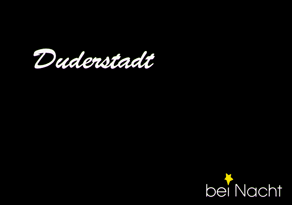
 Siehe ‹bersicht / see overview |
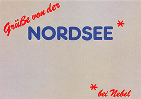
| - | See 721, See 722, See 723, See 730 |
1991-1992 |
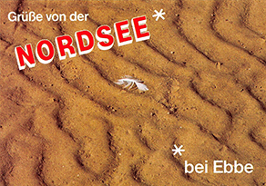
Nicht akzeptiert sind diese Karten von der Nordsee und Ostsee ("bei Nebel", "bei Sonnenschein", "bei Ebbe"). /
Non accpted are these cards from the North Sea and Baltic Sea ("in fog", "in sunshine", "at low tide").
|
||
| #4 | Schwad 547 | 1992 | 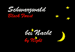 |
 |
Einzige mehrsprachige Karte - wieder in Schriftart "Brush Script". Der Mond wurde (mit weiteren Sternen) an anderer Stelle und grŲŖer positioniert. / Only multilingual card - again in font "Brush Script". The moon was positioned (with some more stars) elsewhere and larger. |
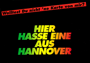
| - | Hvr 0227 | 1993 |
Nicht akzeptiert ist diese Karte von Hannover. /
Non accpted is this card from Hannover. ("Didn't you want a card from me? - Here you have one from Hannover")
|
||
| #5 | Bal 560 & andere/others | 1995-1997 | 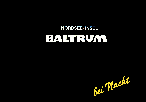 |
 |
Ab ca. 1995 wurden einzelne Karten mit schršgem "bei Nacht" in Font "Brush Script" ohne Stern und Mond herausgebracht, ggf. mit Verzierungen an anderen Stellen.
Die Schriftart des Ortsnamens ist unterschiedlich. / From about 1995, individual cards were released with oblique "bei Nacht" in font "Brush Script" without the star and moon, sometimes with further decorations. The font used for the location name differes. 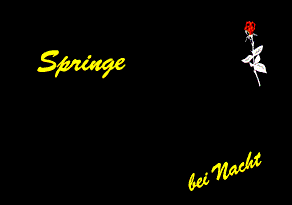
|
| #6 | Hedf 503, Amr 618, Nib 501 | 1995 |  |
 |
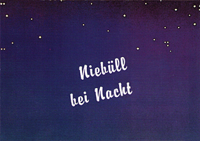
Ein neues Design mit blauem Sternenhimmel, mit und ohne Wappen. Diesmal mit unterschiedlichen Schriftarten ("Brush Script", "Impuls" und "Brody"). / A new design with blue starry sky, with and without badge. This time with different fonts ("Brush Script", "Impuls", and "Brody"). 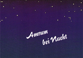
|
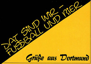
| - | Dod 802 |
Nicht akzeptiert ist diese Karte aus Dortmund "Dat sind wir - Fussball und Bier / GrŁŖe aus Dortmund". /
Non accpted is this card from Dortmund. ("This is us - football and beer / Greetings from Dortmund")
|
|||
| #7 | Fer 545, Dod 812, HŲx 614 | 1996 |   |
 |
Ein neues Design war der comic-šhnliche Vollmond in Schriftart "Brush Script". FŁr die meisten Stšdte wurde šhnlich wie bei Karten vom Wadmanns Forlag aus Dšnemark unten eine Reihe von FuŖpaaren ergšnzt./
A new design was the comic-like full moon in font "Brush Script. For most cities, a row of pairs of feet was added at the bottom, similar to cards from Wadmanns Forlag in Denmark.
|
| Qck 531 | 1996 |  |
FŁr QuakenbrŁck wurde der gleicher Vollmond mit Froschspuren kombiniert (Schriftart "Brody") /
For QuakenbrŁck the same full moon was combined with frog tracks (font "Brody")
|
||
| Qck 531 | 1996 | 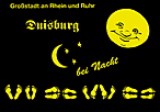 |
Bei Duisburg (in Schriftart "Fette Fraktur") wurde ein zweiter Mond und Sterne ergšnzt. /
For Duisburg (in font "Fette Fraktur") a second moon and stars were added.
|
||
| Tr 110 | 1998 |  |
 |
type art satz & grafik, D-Dortmund
Nachdem Cramers an SchŲning im Jahr 1997 verkauft wurde, hat die Produktionsstštte in Dortmund neu firmiert und noch einige Postkarten mit gleichen OrtskŁrzeln (aber neuen Nummern) und gleicher Jahr/Auflage-Logik hergestellt.
FŁr die Vorderseite wurden Elemente der Cramers-Karten aufgriffen, wie bei der Karte von Trier (in Schriftart "Cascade Script") der "bei Nacht"-Schriftzug in "Brush-Script"... / After Cramers was sold to SchŲning in 1997, the production facility in Dortmund rebranded and produced some more postcards with the same place abbreviations (but new numbers) and the same year/edition logic. For the front, elements of the Cramers cards were taken up, like for the card from Tries (in font "Cascade Script") the "bei Nacht" lettering in "Brush Script"... |
|
| MŁd 116 | 1999 |  |
 |
... oder hier der Vollmond. / ... or here the full moon.
Schriftart / font: "Cascade Script"
|
|
| Bie 555 | 1998 |
Mit gleichem Vollmond wurde auch eine nicht-akzeptiertes Design ("Viele GrŁŖe aus .... an den Rest der Welt") erstellt,
das es so šhnlich auch von z.B. dem "SchŲning Verlag" gab./
With the same full moon, a similar, not-accepted design ("Greetings from ... to the rest of the world") was created,
which is similar to designs from e.g. "SchŲning Verlag".

|