


Übersicht des Verlags und Herstellers / Overview from publisher and manufacturer
"Kina Italia"
| Postkarten auf Karte / | |
| Cards on Map |
Layouts & Logos © Kina Italia, I-Milano, ab/from 2003 EuroGrafica / L.E.G.O. Group,
in einigen USA-Fðllen/in some cases for the US: © Werner J. Bertsch (photographer and representative of KINA in the US, east of the Mississippi),
und ggf. weiterer Verlage/and maybe more publishers.
![]() Logo von Marzari (ab ~1975) - dem fr■heren Namen von Kina Italis, benannt nach dem Gr■nder Paolo Marzari 1894. / Logo from Marzari (since ~1975) - the old name of Kina Italia, from its founder Paolo Marzari 1894.
Logo von Marzari (ab ~1975) - dem fr■heren Namen von Kina Italis, benannt nach dem Gr■nder Paolo Marzari 1894. / Logo from Marzari (since ~1975) - the old name of Kina Italia, from its founder Paolo Marzari 1894.
Dieses Logo wirde in Italien auch nach der Umfirmierung zu Kina Italia weiter genutzt, teilweise sogar auch noch nach der Ébernahme durch EuroGrafica. / This logo was also used in Italy after renaming to Kina Italia and also partly after being part of EuroGrafica.
 Logo von Kina Italia, zuerst international genutzt, ab 2003 auch (anfangs parallel) in Italien. / Logo from Kina Italia, first internationally, after 2003 also (at the beginning in parallel) within Italy.
| # | Verlags- nummer / Number from Publisher |
Jahr / Year | Vorderseite / Front | R■ckseite / Back | Anmerkungen / Remarks |
| #1 | - | ca. 1986 |  |
 |
 Der Verlag "Klein Post Card Service" lieÔ seine Postkarten bei verschiedenen Druckereien herstellen (z.B. Maracom und Dexter).
Die Schriftart ist vermutlich "Century Old Style" oder sehr ðhnlich.
Mind. die Karte aus Cape Cod hat den Hinweis "Made in Italy by Kina Italia, Milan".
Laut Erinnerungen von Herrn W.Bertsch, lieÔ Klein die Karten bei anderen Verlagen nachbestellen, weil die Lieferung von Kina nur einmal im Jahr im Fr■hjahr erfolgte.
/
The publisher "Klein Post Card Service" had its postcards produced by various printers (e.g. Maracom and Dexter).
The font is probably "Century Old Style" or very similar.
According to Mr. W.Bertsch's memories, Klein had the cards reordered from other publishers because Kina's delivery was only once a year in spring.
At least the card from Cape Cod has the note "Made in Italy by Kina Italia, Milan".
Der Verlag "Klein Post Card Service" lieÔ seine Postkarten bei verschiedenen Druckereien herstellen (z.B. Maracom und Dexter).
Die Schriftart ist vermutlich "Century Old Style" oder sehr ðhnlich.
Mind. die Karte aus Cape Cod hat den Hinweis "Made in Italy by Kina Italia, Milan".
Laut Erinnerungen von Herrn W.Bertsch, lieÔ Klein die Karten bei anderen Verlagen nachbestellen, weil die Lieferung von Kina nur einmal im Jahr im Fr■hjahr erfolgte.
/
The publisher "Klein Post Card Service" had its postcards produced by various printers (e.g. Maracom and Dexter).
The font is probably "Century Old Style" or very similar.
According to Mr. W.Bertsch's memories, Klein had the cards reordered from other publishers because Kina's delivery was only once a year in spring.
At least the card from Cape Cod has the note "Made in Italy by Kina Italia, Milan".
|
| #2 | - | ca. 1987-1992 | 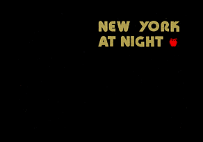  |
  |
Bei den ersten "bei Nacht" Postkarten fungiert Kina Italia als reine Druckerei ("Made by KINA ITALIA Milan, Italy").
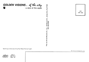
F■r den Verlag "Arrow Novelity Co." wurden zwei Versionen f■r New York in Schriftart "Retro Mono Wide" gedruckt.
Eine gr—Ôere Version mit glðnzender Goldprðgung,
und eine kleinere mit gold ðhnlichem Ton normal gedruckt. /
For the first "at night" postcards, Kina Italia acts purely as a printer ("Made by KINA ITALIA Milan, Italy").
For the publisher "Arrow Novelity Co." two versions were printed for New York in font "Retro Mono Wide".
A larger version with shiny gold stamping,
and a smaller one with gold-like tone printed normally.
|
| #3 | - | 1989 |  |
 |
F■r die "Dakotaland Postcards & Souvenirs Inc." wurden zwei Karten gedruckt.
Angegeben ist hier der gesamte Text "MADE IN ITALY by KINA ITALIA, MILAN" in Majuskeln weiterhin ohne Logo.
/
Two cards were printed for "Dakotaland Postcards & Souvenirs Inc". Indicated here is the entire text
"MADE IN ITALY by KINA ITALIA, MILAN" in majuscules still without logo.
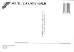
Bei der Karte f■r "South Dakota" wurde der Text fast ■ber die ganze Karte gesetzt - in Schriftart "Mistral".
/
For the card from "South Dakota" the text covers mostly the whole card - using font "Mistral.
|
| #4 | - | 1990 |  |
 |
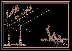
Zweites Design f■r "Dakotaland Postcards & Souvenirs Inc." f■r den "Corn Palace" in Mitchell, South Dakota - mit Schriftart "Geometric 885".
/
Second design for "Dakotaland Postcards & Souvenirs Inc." for the "Corn Palace" in Mitchell, South Dakota - with font "Geometric 885".
|
| #5 | - | ca. 1990 |  |
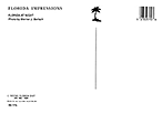 |
Der Fotograf Werner J. Bertsch hat f■r Kina Italia neben vielen Bildpostkarten auch Kalendermotive fotografiert.
Als Vertreter von KINA f■r die USA —stlich des Mississippi,
hat er Ende der 1980er Jahre mit Corel-Draw auch "bei Nacht" Postkarten entworfen, wie hier z.B. f■r Florida mit Schriftart "Futura Script".
Die Karten wurde dann den Distributoren (wie hier "Scenic Florida Distributors") angeboten und f■r diese dann in Italien gedruckt und einmal pro Jahr im Fr■hjahr in die USA verschickt wurden.
"Photo by Werner J. Bertsch" & "MADE IN ITALY by KINA ITALIA, MILAN".
/
Photographer Werner J. Bertsch has photographed calendar motifs as well as many picture postcards for Kina Italia.
As KINA's representative for the USA east of the Mississippi,
he also designed "at night" postcards with Corel-Draw in the late 1980s, like this one for Florida using the font "Futura Script".
The cards were then offered to distributors (like "Scenic Florida Distributors" here) and then printed for them in Italy and sent to the USA once a year in spring.
"Photo by Werner J. Bertsch" & "MADE IN ITALY by KINA ITALIA, MILAN".
|
| #6 | - | ca. 1990 |  |
 |
Diese Karte von Milano erwðhnt Kina Italia nicht, ist aber vermutlich die erste Karte von von Kina aus Italien. Nur der Distributor "Ed. Luigi Scrocchi, I-Milano" ist angegeben.
/
This card from Milano does not mention Kina Italia, but is probably the first card from Italy by Kina. Only the distributor "Ed. Luigi Scrocchi, I-Milano" is indicated.
Indizien, dass Design #6, #7 und #8 von Kina Italia sind, sind: / Indications that design #6, #7 and #8 are from Kina Italia are: 1) Die R■ckseiten dieser drei Karten sind gleich und ðhnlich zu denen von Kina./ The backs of these three cards are the same and similar to those of Kina. 2) Design #7 wurde als Design #12 mit Angabe von Kina wieder aufgelegt./ Design #7 was reissued as design #12 with indication from Kina. 3) Ferner ist der Hinweis "Bitte nicht unterhalb dieser linie schreiben" mit dem kleingeschriebenen Wort "linie" identisch zu den Karten von Kina. (Bei anderen Verlagen ist dies groÔ geschrieben und meist das Wort "Zeile" verwendet.) / Furthermore, the note "Bitte nicht unterhalb dieser linie schreiben" with the word "linie" written (wrongly) in lower case is identical to the cards from Kina. (other publishers capitalize this and usually use the word "line").
Dieses Design mit Schriftart "OPTIPinBall" gibt es auch vom Verlag "Carminati Stampatore" aus Bergamo,
der bereits ca. 1989 dieses Layout f■r viele Orte in Norditalien verwendet hat. Vermutlich war Kina-Italia hier auch die Druckerei.
Bei der Karte aus Milano gibt es eine Neuauflage in schlechterer Qualitðt.
/
This design with font "OPTIPinBall" exists also from the publisher "Carminati Stampatore" from Bergamo,
who already used this layout for many places in northern Italy around 1989. Probably Kina-Italia printed also these cards.
The card from Milano exists in a re-issued version in worse quality.
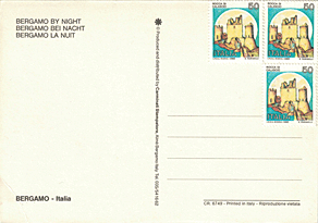
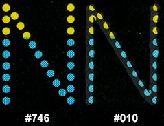 (Bergamo: #746 / (Bergamo: #746 /Milano: #010) |
| #7 | - | ca. 1990 |  |
 |
Einzelst■ck f■r Verona mit Schriftart "Glowworm" - in gr—Ôerem Format. Wieder ist nur der Distributor, diesmal "Randazzo - Ed. Turistiche, I-Verona" angegeben.
Wie auch bei Design #6 ist der Text in den Farben gelb-blau gehalten. Diese Farben sind in Norditalien verbreitet und stammen urspr■nglich vom Herzogtum Parma.
/ Single piece for Verona using font "Glowworm"- in larger format. Again, only the distributor is indicated, this time "Randazzo - Ed. Turistiche, I-Verona". Same as design #6, the text is in the colors yellow-blue. These colors are common in northern Italy and originate from the Duchy of Parma. |
| #8 | - | ca. 1990 |  |
 |
Die Karte f■r Milano und Verona (Schriftart "Helvetica") wurde f■r die gleichen Distributoren und mit gleichen R■ckseiten wie Design #6 und #7 hergestellt - Wieder ohne Angabe von Kina Italia.
Das Design wurde spðter (siehe #12 mit Angabe von Kina Italia) neu aufgelegt. / The card for Milano and Verona (font "Helvetica") was produced for the same distributors and with the same backs as design #6 and #7 - again without indication of Kina Italia. The design was reissued later (see #12, indicating Kina Italia). |
| #9 | 24770/F | ca. 1991 |  |
 |
Einzelst■ck f■r den Distributor "Verlag/Ed. Sciliaria, I-Schlern" mit Schriftart "Kuenstler Script"./
Single piece for the distributor "Publisher/Ed. Sciliaria, I-Schlern" using font "Kuenstler Script".
The back is now the standard 1990s layout of Kina Italia, which then also got like many Italian publishers the "OK" logo for good design quality. |
| #10 | 26343, 34425 |
ca. 1991-1993 | 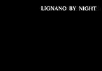 |
 |
F■r den Distributor "Guerin" an der Adria wurde dieses klassische Design in Schriftart "Life" f■r mind. zwei Orte hergestellt.
Weiterhin mit Marzani-M als Logo und die Standardr■ckseite. /
For the distributor "Guerin" on the Adriatic Sea, this classic design using font "Life" was made for at least two locations.
Still with Marzani-M as logo and the standard back.
|
| #11 | verschiedene im Bereich: / various in the range: 26475 - 32042/F |
ca. 1991-1995 |  |
   |
Hauptdesign von Kina-Italia, weiterhin Marzani-M als Logo. /
Main design by Kina-Italia, still Marzani-M as logo. Das Verbreitungsgebiet besteht hauptsðchlich aus Stðdten in Ligurien (Distr. "Ligur Colors, I-Sanremo") und Alpentðlern der Lombardei (Distr. "Edizioni Di-Val, I-Sondrino"). Aber auch f■r den Gardasee, Mantova und Versilia wurden Karten mit diesem Layout erstellt. Nur bei zwei Karten wurde die R■ckseite anders gestaltet als das Standard-Layout. / The distribution area consists mainly of cities in Liguria (Distr. "Ligur Colors, I-Sanremo") and Alpine valleys of Lombardy (Distr. "Edizioni Di-Val, I-Sondrino"). But cards with this layout were also produced for Lake Garda, Mantova and Versilia. Only for two cards the backside was designed differently from the standard layout.  Der scheinbar gepunktete Text besteht aus Buchstaben aus einem 7x11-Raster von kleinen Sternchen der Schriftart "Star Marquee".
Je nach Text-Lðnge ist die Gr—Ôe angepast - von 6,4 mm bis 13,5 mm H—he
/
The seemingly dotted text consists of letters from a 7x11 grid of small stars from the font "Star Marquee".
Depending on the length of the text the size is adapted from 6.4 mm to 13.5 mm height.
Der scheinbar gepunktete Text besteht aus Buchstaben aus einem 7x11-Raster von kleinen Sternchen der Schriftart "Star Marquee".
Je nach Text-Lðnge ist die Gr—Ôe angepast - von 6,4 mm bis 13,5 mm H—he
/
The seemingly dotted text consists of letters from a 7x11 grid of small stars from the font "Star Marquee".
Depending on the length of the text the size is adapted from 6.4 mm to 13.5 mm height.
|
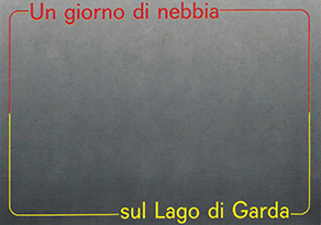
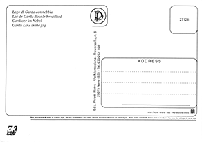
| - | 27128 | ca. 1991 |
Neben den schwarzen "bei Nacht" Postkarten gibt es auch von KINA ITALIA graue "nebbia" ("im Nebel") Karten - wie bei vielen anderen Verlagen auch.
/
In addition to the black "at night" postcards, there are also gray "nebbia" ("in the fog") cards from KINA ITALIA - as with many other publishers.
|
||
| #12 | 27244, 31431, 33604 |
ca. 1991-1993 |    |
 |
Weiterentwicklungen des Designs #8, in hellerem gelb, mit neuem abnehmendem Mond und neu gestalteten Sternen. Die Reihenfolge der Sprachen variiert./
Evolutions of design #8, in brighter yellow, with a new decreasing moon and redesigned stars. The order of the languages varies.
Die Karte vom Gardasee nutzt weiterhin die "Helvetica"-Schriftart, wðrend f■r die Adriak■ste ("Adriatikk■ste") und Versilia die Schriftart "ITC Eras" genutzt wurde./
The card from Lake Garda stil uses the font "Helvetica", while for the Riviera Adriatica and Versilia the font "ITC Eras" was chosen.
|
| #13 | 30643, 30645 |
ca. 1992 |  |
 |
Weiterentwicklung des Designs #11 (Schriftart "Star Marquee") f■r Distributor "idp" I-Napoli.
Nun in gelb und mit grafischen Elementen aus Design #12 (dem abnehmendem Mond rechts der Mitte und drei der Sterne).
/
Evolution of design #11 (font "Star Marquee") for distributor "idp" I-Napoli.
Now in yellow and with graphic elements from design #12 (the decreasing moon right of center and three of the stars).
|
| #14 | 31115, 31272 |
ca. 1991 |  |
 |
Mit gleichen Sternen und Mond nun als zweisprachige Karte in Schriftart "Murray Hill" wurde ein Design mind. f■r S■dtirol und Sardinien erstellt. /
With the same stars and moon now as a bilingual card using font "Murray Hill" was created a design at least for South Tyrol and Sardinia.
Dieses Design wurde mit anderen Sternen (und z.T. mit anderer Schriftart) mehrfach nachgeahmt: / This design has been imitated several times with other stars (and partly with different font): 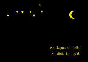

|
| #15 | 32183 | ca. 1991 | 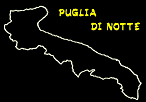 |
 |
Ohne Angabe eines konkreten Distributors (vermutlich da es in der ganzen Region Puglia vertrieben werden konnte) wurde diese Karte mit Umriss von Puglia in Schriftart "Hand Drawn" hergestellt.
Dieses Design existiert mind. auch f■r Kalabrien (mit Umriss von Kalabrien),
die ich leider nicht in meiner Sammlung habe. /
Without specifying a specific distributor (probably as it could be distributed throughout the region of Puglia) this card with outline of Puglia was created using font "Hand Drawn".
This design exists at least also for Calabria (with outline of Calabria),
which unfortunately I do not have in my collection.
|
| #16 | - | ca. 1991 |  |
 |
Kina Italia war auch im Ausland aktiv.
F■r Biarritz wurde das Design #14 zu einem einsprachigen Design abgewandelt, das weiter die Schriftart "Murray Hill" nutzt. /
Kina Italia was also active abroad.
For Biarritz, design #14 was modified to a one-language design, still using font "Murray Hill".
Kina ist nur mit dem Logo erwðhnt.
Ansonsten ist deben der Adresse des Verlags "Editions REX" nur ein "ImprimÕ en C.E.E." angegeben. /
Kina is only mentioned with the logo.
Besides that, only an "ImprimÕ en C.E.E." is given next to the publisher's address "Editions REX".
|
| #17 | - | 1991 |  |
 |
áhnlich wie andere Verlage lieÔ auch der Verlag HPS aus USA-Dover DE bei verschiedenen Druckereien die Postkarten herstellen, z.B. Dexter.
Mindestens die Neuauflage von Ocean City und die Karte von Bethany Beach (beide mit Schriftart "Belwe") sind von Kina Italia: "Made in Italy by Similar to other publishers, the publisher HPS from USA-Dover DE also had the postcards produced by different printers, eg. Dexter. At least the re-issue for Ocean City and the card from Bethany Beach (both with font "Belwe") are from Kina Italia: "Made in Italy by |
| #18 | - | 1991 |  |
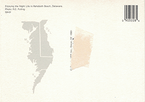 |
Mit gleicher Schriftart wurde eine Karte in rot f■r Rehoboth Beach ver—ffentlicht mit "Made in Italy by With same font the card for Rohoboth Beach was issued with "Made in Italy by |
| #19 | - | ca. 1992-1993 |  |
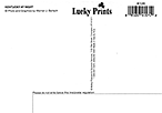 |
Die Karte von Kentucky mit Schriftart "Helvetica" ist wieder eine Karte von Werner J. Bertsch, "Made in Italy by Kina".
Diesmal f■r "Molloy Postcard & Souvenir Services" mit ihrem Branding "Lucky Prints".
áhnlich zu den "Wildlife"-Karten von Maracom und Dexter,
wurden auch von Werner J. Bertsch f■r Kina Italia "Nightlife" Karten mit vielen Augenpaaren entworfen, mit einem Mond-Foto-von W.Bertsch.
/
The card from Kentucky with font "Helvetica" is another card from Werner J. Bertsch, "Made in Italy by Kina".
This time for "Molloy Postcard & Souvenir Services" with their branding "Lucky Prints".
Similar to the "Wildlife" cards by Maracom and Dexter,
"Nightlife" cards with lot of eyes were also designed by Werner J. Bertsch for Kina Italia, with a moon photografic picture from W.Bertsch.
|
| #20 | - | ca. 1992-1993 |  |
 F■r Indiana wurde fast das identische Design ver—ffentlicht, das sich nur um ein weiteres Tier unterscheidet, bei dem der Text (in "Helvetica") auch etwas fetter gedruckt wurde.
/
For Indiana nearly the same design was used, which only differs by one animal, for which the text (in font "Helvetica") also was printed a little bolder.
F■r Indiana wurde fast das identische Design ver—ffentlicht, das sich nur um ein weiteres Tier unterscheidet, bei dem der Text (in "Helvetica") auch etwas fetter gedruckt wurde.
/
For Indiana nearly the same design was used, which only differs by one animal, for which the text (in font "Helvetica") also was printed a little bolder.
Der Barcode der Karte verweist bei beiden auf Maracom. Werner Bertsch vermutet, dass Molloy davor andere Karten bei Maracom herstellen lieÔ, und die R■ckseite inkl. Barcode unverðndert lassen wollte. / The barcode on the card refers on both cards to Maracom. Werner Bertsch suspects that Molloy had other cards manufactured by Maracom before that, and wanted to leave the back incl. barcode unchanged. |
|
| #21 | - | 1993 | 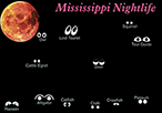 |
 |
Die Karte aus Mississippi mit Schriftart "Aldine 721" ist die dritte "Nightlife"-Karte mit Vollmond.
Die Augenpaare sind bei allen unterschiedlich und vermutlich den lokalen Tieren angepasst.
/
The card from Louisiana with font "ITC Souvenir" is the third "Nightlife" card with full moon.
The pairs of eyes are different for all of them and probably adapted to the local animals.
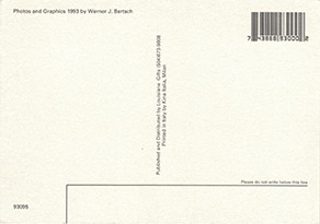
"Photo and Graphics Copyright 1993 by Werner J. Bertsch" - "Printed in Italy by Kina Italia, Milan". |
| #22 | - | 1993 | 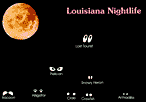 |
 |
Die Karte aus Louisiana mit Schriftart "ITC Souvenir" ist die vierte "Nightlife"-Karte mit Vollmond.
/
The card from Louisiana with font "ITC Souvenir" is the forth "Nightlife" card with full moon.
"Photo and Graphics Copyright 1993 by Werner J. Bertsch" - "Printed in Italy by Kina Italia, Milan". |
| #23 | - | ca. 1993 | 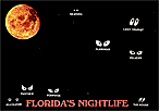 |
 |
Die Karte aus Florida mit Schriftart "Windsor" ist die f■nte "Nightlife"-Karte mit Vollmond.
Wieder: "Scenic Florida Dist" & "MADE IN ITALY by KINA ITALIA, MILAN". Das Format der Karte ist diesmal etwas gr—Ôer.
/
The card from Florida with font "Windsor" is the fifth "Nightlife" card with full moon.
Again: "Scenic Florida Dist" & "MADE IN ITALY by KINA ITALIA, MILAN". The size of the card is a little larger.
|
| #24 | - | ca. 1994 | 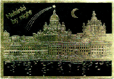 |
 |
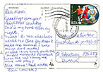
Die Karte aus Helsinki (mit Schriftaert "VAG Rounded") ist eine von mehreren Karten, die f■r den finnischen Verlag "Paletti" mit Goldprðgung hergestellt wurden.
Sie haben den gleichen Mond wie in Designs #12, #13, #14 & #16, jedoch statt Sternen einen Kometen. /
The card from Helsinki (with font "VAG Rounded") is one of several cards, which where made gold stamping for the Finnish publisher "Paletti".
They have the same moon as in designs #12, #13, #14 & #16, but instead of stars a comet.
Angegeben ist jeweils / Indicated in each case is: " |
| #25 | - | ca. 1994 |  |
 |
Die Karte aus der zweisprachigen Stadt Hanko/Hang— nutzt die Schriftart "Hand Drawn".
Sie wurde ebenfalls f■r finnischen Verlag "Paletti" hergestellt. /
The card from the bilingual city Hanko/Hang— uses the font "Hand Drawn".
It was also produced for the Finnish publisher "Paletti".
|
| #26 | - | ca. 1994 |  |
 |
Die Karte aus Turku nutzt die Schriftart "Park Avenue".
Sie wurde ebenfalls f■r finnischen Verlag "Paletti" hergestellt. /
The card from Turku uses the font "Park Avenue".
It was also produced for the Finnish publisher "Paletti".
|
| #27 | - | ca. 1994 |  |
 |
Die Karte aus Hyvinkðð nutzt zwei Schriftarten: f■r den Ortsnamen "VAG Rounded" und f■r das by night "Park Avenue".
Sie wurde ebenfalls f■r finnischen Verlag "Paletti" hergestellt. /
The card from Hyvinkðð uses two fonts: for the location name "VAG Rounded" and for the by night "Park Avenue".
It was also produced for the Finnish publisher "Paletti".
Neben diesen 4 Designs, die bei Kina gedruckt und z.T. gestaltet wurden, hat Paletti auch bei "Tamprint" in Finnland Postkarten mit Goldprðgung herstellen lassen (Saariselkä & Lahti), bei denen der Goldton etwas r—tlicher ist und Mond und Komet nachgeahmt, aber auch etwas anders sind. / In addition to these 4 designs printed and partly designed at Kina, Paletti has also had postcards with gold stamping made at "Tamprint" in Finland (Saariselkð & Lahti), where the gold tone is a bit more reddish and the moon and comet are imitated, but also a bit different. 
|
| #28 | - | ca. 1995 | 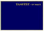 |
 |
F■r den finnischen Verlag "PR Kortti" wurde eine Karte weiÔem Rahmen und blauem Hintergrund mit Schriftart "Broadway" (in Schriftschnitt "Com Engraved") - wieder mit Goldprðgung gedruckt.
Das Design ist vermutlich vom Verlag.
/
For the Finnish publisher "PR Kortti" was printed a card white frame and blue background with font "Broadway" (in variant "Com Engraved") - again with gold stamping.
The design is probably from the publisher.
|