Übersicht des Verlags / Overview from publisher
"Columbia Publishing"
| Postkarten auf Karte / | |
| Cards on Map |
Layouts & Logos © Columbia Publishing, USA-Ojai, CA
| # | Verlags- nummer / Number from Publisher |
Jahr / Year | Vorderseite / Front | R¸ckseite / Back | Anmerkungen / Remarks | ||||||||||||||||||||||||
| - | H1 | ~1960s/ 1970s |
  Die vermutlich erste Postkarte von Columbia Publishing ist die "Greetings from Southern California" - der Heimat des Verlags. / Probably the first postcard from Columbia Publishing is the "Greetings from Southern California" - the home of the publishing house. 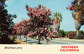
|
||||||||||||||||||||||||||
| - | Hxxxx | ~1960s/ 1970s/ 1980s |
 In diesem Nummernkreis verˆffentlichte Columbia Publishing Postkarten tausende von Karten,
die im Format 3.5 x 5.5 inch (ca. 9 x 14 cm) zumindest z.T. bei "Koppel Color Cards" herstellt wurden.
/
Within this numbering range, Columbia Publishing issued thousands of cards, which were printed in format 3.5 x 5.5 inch (ca. 9 x 14 cm) at least partly from "Koppel Color Cards".
In diesem Nummernkreis verˆffentlichte Columbia Publishing Postkarten tausende von Karten,
die im Format 3.5 x 5.5 inch (ca. 9 x 14 cm) zumindest z.T. bei "Koppel Color Cards" herstellt wurden.
/
Within this numbering range, Columbia Publishing issued thousands of cards, which were printed in format 3.5 x 5.5 inch (ca. 9 x 14 cm) at least partly from "Koppel Color Cards".
Sp‰ter zog Columbia Publishing nach Hollywood. / Later Columbia Publishing moved to Hollywood. 
|
||||||||||||||||||||||||||
| - | T-001 | ~1980s |
In den 1980er Jahren wurde das Format auf 4 x 6 inch (ca. 10,2 x 15,3 cm) und im DIN-Format (ca. 10,5 x 14,8 cm) mit dem Nummernkreis T-xxx ge‰ndert.
Sie wurde bei dexter in Kanada hergestellt.
Sp‰ter hat Columbia Publishing hat die Karten haupts‰chlich bei John Hinde,
ColorPress / Maracom und Lawson Mardon / H.S. Crocker herstellen lassen.
/
In the 1980s, the format was changed to 4 x 6 inches (approx. 10.2 x 15.3 cm) and in DIN format (ca. 10,5 x 14,8 cm) with the number range T-xxx.
They were produced by dexter in Canada.
Later Columbia Publishing mainly used the manufacuters John Hinde,
ColorPress / Maracom and Lawson Mardon / H.S. Crocker.
Die erste Karte kam aus Ventura. / The first card was from Ventura. 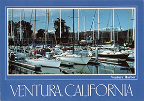
Inzwischen war der Verlag nach Ojai nordwestlich von LA gezogen. / In the meantime, the publishing house had moved to Ojai, north west of LA. 
|
||||||||||||||||||||||||||
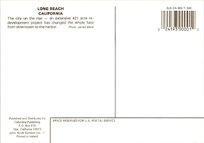
| #1 | T-398 | ~1992 |  |
 |
 Alle "at night" Karten haben auf der R¸ckseite den Zusatz "Ruhig und friedlich."
/
All "at night" cards have the words "Serene and peaceful." on the back.
Alle "at night" Karten haben auf der R¸ckseite den Zusatz "Ruhig und friedlich."
/
All "at night" cards have the words "Serene and peaceful." on the back.
 Bei welchem Hersteller die Karten gedruckt wurden, ist nicht angegeben.
Auf Grund des Formats ( 4 x 6 in) und der Tatsache, dass John Hinde und Color Press/Maracom immer die eigene Nummer zus‰tzlich aufdrucken (also als Hersteller vermutlich ausscheiden),
ist es hˆchst wahrscheinlich, dass Columbia Publishing die "at Night" Karten bei Lawson Mardon hergestellt wurden.
/
The manufacturer who printed the cards is not indicated.
Due to the format (4 x 6 in) and the fact that John Hinde and Color Press/Maracom always printed their own number in addition (and due to this are most probably not the manufacturers),
it is highly likely that the "at Night" cards from Columbia Publishing were manufactured by Lawson Mardon.
Bei welchem Hersteller die Karten gedruckt wurden, ist nicht angegeben.
Auf Grund des Formats ( 4 x 6 in) und der Tatsache, dass John Hinde und Color Press/Maracom immer die eigene Nummer zus‰tzlich aufdrucken (also als Hersteller vermutlich ausscheiden),
ist es hˆchst wahrscheinlich, dass Columbia Publishing die "at Night" Karten bei Lawson Mardon hergestellt wurden.
/
The manufacturer who printed the cards is not indicated.
Due to the format (4 x 6 in) and the fact that John Hinde and Color Press/Maracom always printed their own number in addition (and due to this are most probably not the manufacturers),
it is highly likely that the "at Night" cards from Columbia Publishing were manufactured by Lawson Mardon.
T-384 (John Hinde): 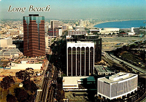
 T-399 (Color Press): 
|
||||||||||||||||||||||||
| - | T-400 | ~1992 |
Erw‰hnenswert ist die Karte T-400, die von ColorPress f¸r verschiedene Verlage herausgebracht wurde:
/
The T-400 card is worth mentioning, which was issued from ColorPress for different publishers:
|
||||||||||||||||||||||||||
| #2 | T-479 | ~1993 |  |
 |
 Die zweite Karte wurde f¸r Ojai, dem Sitz des Verlags verˆffentlicht.
Der Ortsname wurde in der damals weit verbreiteten "Brush Script" gesetzt, "at night" in "Helvetica".
Bei dieser und allen weiteren Karten ist "at night" und der Rahmen in reinem weiþ.
/
The second card was published for Ojai, the publisher's headquarters.
The font of the town name was the that time popular "Brush Script", "at night" in "Helvetica".
On this and all other cards, "at night" and the frame are in pure white.
Die zweite Karte wurde f¸r Ojai, dem Sitz des Verlags verˆffentlicht.
Der Ortsname wurde in der damals weit verbreiteten "Brush Script" gesetzt, "at night" in "Helvetica".
Bei dieser und allen weiteren Karten ist "at night" und der Rahmen in reinem weiþ.
/
The second card was published for Ojai, the publisher's headquarters.
The font of the town name was the that time popular "Brush Script", "at night" in "Helvetica".
On this and all other cards, "at night" and the frame are in pure white.
|
||||||||||||||||||||||||
| T-480 - T-486 |
~1993 |  |
Gleichzeitig wurden f¸r weitere Orte nordwestlich und ˆstlich von Los-Angeles weitere Postkarten im gleichen Stil verˆffentlicht.
(T-484 fehlt in meiner Sammlung, ist aber hˆchst wahrscheinlich auch eine "at night" Postkarte.)
Das Grundlayout ist weiterhin gleich: Runder Rahmen, oben unterbrochen f¸r den Ortsnamen und in zweiter Zeile darunter das "at Night".
/
At the same time, further postcards in the same style were published for other places northwest and east of Los-Angeles.
(T-484 is missing from my collection, but is most likely also an "at night" postcard).
The basic layout is still the same: round frame, interrupted at the top for the place name and the "at Night" in the second line.
Die Schriftart ist bei diesen Karte meist eine andere aber f¸r beide Zeile jeweils die gleiche Schriftart. /
The font used on these cards is usually different, but the same font is used for both lines.


|
||||||||||||||||||||||||||
| T-706 - T-713 |
~1994 |  |
Ca. ein Jahr sp‰ter wurden f¸r weitere Orte in dieser Gegend "at night" Postkarten verˆffentlicht.
(T-710 und T-712 fehlen in meiner Sammlung, sind aber auch hˆchst wahrscheinlich auch "at night" Postkarten.)
/
About a year later, "at night" postcards were published for other places in this area.
(T-710 and T-712 are missing from my collection, but are most likely also "at night" postcards).
Es wurden wieder weitere, meist verschiedene Schriftaerten gew‰hlt. /
Once again, additional fonts were selected, most of which were different.


|