


Übersicht des Verlags / Overview from publisher
"Italcards / Fotometalgrafica"
| Postkarten auf Karte / | |
| Cards on Map |
Layouts & Logos © Italcards by la Fotometalgrafica, I-Bologna
| # | Jahr / Year | Vorderseite / Front | RŁckseite / Back | Anmerkungen / Remarks |
| #1 | ~1989 |  |
 |
"Italcards" ist die Postkarten-Marke des Herstellers "Fotometalgrafica" aus Bologna, der fŁr verschiedene Distributoren Karten herstellte. Nummern von Italcards wurden nicht auf die Karten gedruckt, so dass die Reihenfolge nicht ganz klar ist. / "Italcards" is the postcard brand of the manufacturer "Fotometalgrafica" from Bologna, which produced cards for various distributors. Numbers of Italcards were not printed on the cards, so the sequence is not quite clear. Als "bei Nacht"-Postkarte wurde dieses Design mit Mondsichel und drei Sternen fŁr viele Stšdte verwendet, wobei der Schriftzug der Stadt unterschiedlich ausfšllt. / As a "by Night" postcard, this design with crescent moon and three stars has been used for many cities, with the city lettering varying.  Die Karte von Pisa nutzt ITCs Schriftart "Banner" mit dem alternativen Glyphen fŁr das h. Der Schatten verschwindet mit dem schwarzen Untergrund./
The Pisa card uses ITC's "Banner" font with the alternative glyph for the h. The shadow disappears with the black background.
Die Karte von Pisa nutzt ITCs Schriftart "Banner" mit dem alternativen Glyphen fŁr das h. Der Schatten verschwindet mit dem schwarzen Untergrund./
The Pisa card uses ITC's "Banner" font with the alternative glyph for the h. The shadow disappears with the black background.
|
 |
 |
Die Karte aus Marina di Massa nutzt ITCs Schriftart "Brighton" etwas geneigt.
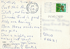
Meine Karte wurde 1989 verschickt, so dass dies ein guter Hinweis auf das VerŲffentlichungsjahr dieses Designs ist.
Auf der RŁckseite haben die Karten von Italcards ein Adressfeld mit Rand mit abgerundeten Ecken.
/
The card from Marina di Massa uses ITC's font "Brighton", slightly slanted.
My card was sent in 1989, so this is a good indication of the year of publication of this design.
On the back, Italcards cards have a border address field with rounded corners.
|
||
 |
 |
Besonders zu erwšhnen ist die Karte aus Livorno, weil dieses Design inkl. der Schriftart "Balmoral" auch von "Ed. Gross" fŁr eine Karte aus Rimini verwendet wurde.
Die Rimini-Karte ist im Format grŲŖer (17,0 cm x 12,0 cm) hat aber identischen Mond in der GrŲŖe von Livorno - es wurde einfach ringsum das schwarz vergrŲŖert.
Ob die Rimini-Karte auch von Italcards hergestellt wurde, kann man nicht erkennen.
/
The card from Livorno deserves special mention because this design (incl. the use of the font "Balmoral") was used with by "Ed. Gross" for a card from Rimini.
The Rimini card is larger in size (17.0 cm x 12.0 cm) but has identical moon in size of Livorno - it was simply enlarged all around the black.
Whether the Rimini card was also produced by Italcards, one cannot be seen.


|
||
 |
 |
Die Karte von Sardinien nutzt die Schriftart "Ambassador Script".
/
The card from Sardinia uses the font "Ambassador Script".
|
||
 |
 |
Komplett ohne Nennung von Italcards oder Fotometalgrafica kommt die Karte von Taormina aus.
Die gleichgestaltete RŁckseite (speziell das Adressfeld) wie die anderen Karten von Desgin #1
und die gleiche Schriftart "Edwardian" (kursiv, wie bei Linotype), die auch bei Karten von Design #2 benutzt wurde, sind eindeutige Hinweise auf Italcards.
/
The card of Taormina is completely without naming Italcards or Fotometalgrafica.
The same layout on the back (especially the address field) as used for other cards of decisgn #1
and the same font "Edwardian" (italic, like from Linotype), which also were used for cards of design #2, are clear indications of Italcards.
|
||
 |
 |
Die Karte von Ravenna nutzt die Schriftart "Freestyle Script".
/
The card from Ravenna uses the font "Freestyle Script".
Bei ihr ist das Adressfeld anders gestaltet. Ggf. handelt es sich hier um eine Neuauflage. / This card has a different address field. Possibly this is a new edition. |
||
| ~1994 |  |
 |
FŁr einige Verlage im Westen der USA wie z.B. Seaich Corp. aus Salt Lake City in Utah war Fotometalgrafica/Italcards auch der Hersteller der Karten.
Als Schriftart wurde hier wieder "Balmoral" verwendet.
Die Adress-Seite ist in den USA anders als in Italien.
Dieser Verlag Seaich Corp. hat weitere Karten auch bei H.S. Crocker und Maracom herstellen lassen.
/ For some publishers in the western USA such as Seaich Corp. from Salt Lake City in Utah, Fotometalgrafica/Italcards was also the manufacturer of the cards. As font, again "Balmoral" was used. The address side is different in the USA than in Italy. This publisher Seaich Corp. also had other cards produced by H.S. Crocker and Maracom. |
|
| - | ~1990 |  |
 |
"Image Studioedizioni Acropoli" aus Trento hat das Design #1 kopiert und ein Hšschenpaar ergšnzt. Schriftart: "Brush Script".
Auch die RŁckseite ist anders gestaltet.
In Trentino-SŁdtirol war Italcards nicht aktiv (sondern nur in der Toskana, Emilia-Romagna, Sardinien und Sizilien).
/ "Image Studioedizioni Acropoli" from Trento copied design #1 and added a pair of bunnies. Font: "Brush Script". The back side is also designed differently. Italcards was not active in Trentino-Alto Adige (but only in Tuscany, Emilia-Romagna, Sardinia and Sicily). |
| #2 | ~1990 |  |
 |
Ein zweites Design von Italcards ist dieses mit vielen Sternen und gleicher Mondsichel - nun jedoch als zunehmender Mond.
Die RŁckseite wurde ebenfalls veršndert.
/
A second design by Italcards is this one with many stars and the same crescent moon - but now as a waxing moon.
The reverse side was also changed.
|
 |
Die identische Karte gab es dann auch mit nachtršglich eingedrucktem Ortsnamen in glšnzendem Gold. Welche Serifen-Schrift hierzu verwendet wurde ist nicht genau zu bestimmen.
/
The identical card was then also available with afterwards imprinted place name in shiny gold. Which serif font was used for this, cannot be identified exactly.
|
|||
| #3 | ~1990 - 1999 |  |
  |
FŁr San Marino wurde ein Design von Citysights imitiert. Als Schriftart kam "Cantoria" zum Einsatz. /
For San Marino, a design from Citysights was imitated. As font "Cantoria" was used.
Die RŁckseite wurde bei einer Neuauflage komplett gešndert und hat dann eine Silhouette von San Marino, was auf Mitte/Ende der 1990er Jahre hindeutet. / The back side of the card was changed when reissung it. It then had a silhouette of San Marino, indicating more mid to end of the 1990s. |