


Übersicht des Verlags / Overview from publisher
"John Hinde"
| Postkarten auf Karte / | |
| Cards on Map |
Layouts & Logos © John Hinde Ltd., IRL-Dublin / John Hinde Curteich, USA-Oxnard CA


| # | Verlags- nummer / Number from Publisher |
Jahr / Year | Vorderseite / Front | Rückseite / Back | Anmerkungen / Remarks | ||||||||||||||||
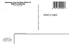
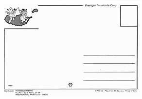
| - | OC-H1269 / 233 | 1954 |  |
 |
Eine klassische Linen-Postkarte vom Postkarten Revolutionär Curt Teich "© Curt Teich Co.", hergestellt im Curteich/Colortone-Verfahren.
Da die Rechte an Curt Teich Co. (und vermutlich "Curteich") nach seinem Tod an John Hinde gingen
und die kalifornische Tochterfirma (John Hinde Curteich) unter diesem Namen weitere "bei Nacht"-Postkarten herstellte,
habe ich diese Karte hier unter "John Hinde" aufgenommen.
/
A classic linen postcard from postcard revolutionary Curt Teich "© Curt Teich Co.", produced by the Curteich/Colortone process.
Since the rights to Curt Teich Co. (and presumably "Curteich") went to John Hinde after his death,
and the California subsidiary (John Hinde Curteich) produced other "at night" postcards under this name,
I have included this card here under "John Hinde".
|
||||||||||||||||
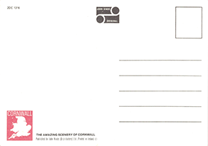
| #1 | 2LD 147, 2DC 1260, 2DH 229, 2SOA 137 & weitere/ further |
~1987 - 1989 |  |
 |
Vermutlich erstes und eines der beiden weit verbreitetsten Designs von "John Hinde (Distributors) Ltd" in England, gedruckt in Irland. / Probably first and one of the two most widely used designs by "John Hinde (Distributors) Ltd" in England, printed in Ireland.  Es nutzt die gleiche Schriftart "ITC Souvenir", Farbe, Position wie die Karten von Dennis & Sons, nur etwas kleinere Schriftgröße./
It uses the same font "ITC Souvenir", color, position as the cards from Dennis & Sons, only slightly smaller font size.
Es nutzt die gleiche Schriftart "ITC Souvenir", Farbe, Position wie die Karten von Dennis & Sons, nur etwas kleinere Schriftgröße./
It uses the same font "ITC Souvenir", color, position as the cards from Dennis & Sons, only slightly smaller font size.
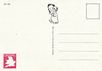
Die Nummerierung besteht aus der "2" für Karten im Normalformat gefolgt von einem Kürzel für die Region und einer fortlaufenden Nummer für die Region, die oft als kleine rote Landkarte abgebildet ist: / Numbering consists of the "2" for normal format cards followed by an abbreviation for the region and a sequential number for the region, often shown as a small red county map:
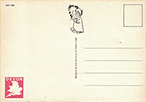
Höchstwahrscheinlich ist die Nummerierung fortlaufend für "bei Nacht"-Karten vergeben, so dass in meiner Sammlung nur die 3 Nummern 2DC 1266, 1268 und 1274 fehlen. (Zusätzlich könnten 2DC 1282 bis 1285; 2DH 231 bis 243; sowie 2SOA 139 bis 147 auch noch "bei Nacht Postkarten sein. 2DC 1259 und 2DC 1286, 2DH 228 und 2DH 255, sowie 2SOA 136 und 148 sind normale Bild-Postkarten.) / Most likely the numbering is consecutive for "by night" cards, so only the 3 numbers 2DC 1266, 1268 and 1274 are missing in my collection. (In addition, 2DC 1282 to 1285; 2DH 231 to 243; and 2SOA 139 to 147 could also be "by night" postcards. 2DC 1259 and 2DC 1286, 2DH 228 and 2DH 255, and 2SOA 136 and 148 are normal picture postcards).  Das zu der Zeit üblichen "John Hinde Original" Logo (siehe z.B. nachfolgende Multiview-Karten)
wurde vermutlich nur für die "bei Nacht"-Postkarten durch einen Schlafwandler ersetzt.
/
The "John Hinde Original" logo common at the time (see e.g. following multi-view cards)
was probably replaced with a sleepwalker only for the "by night" postcards.
Das zu der Zeit üblichen "John Hinde Original" Logo (siehe z.B. nachfolgende Multiview-Karten)
wurde vermutlich nur für die "bei Nacht"-Postkarten durch einen Schlafwandler ersetzt.
/
The "John Hinde Original" logo common at the time (see e.g. following multi-view cards)
was probably replaced with a sleepwalker only for the "by night" postcards.
Für einige Regionen und Städte gab es auch "Multiview" Karten, bei denen nur ein Viertel schwarz war. Z.B. : / For some regions and cities, there were also "multiview" cards where only one quarter was black. E.g.: Blackpool (2BP 97), Newquay (2DC 1314), Torbay (2DC 1315), Cornwall (2DC 1316), Devon (2DC 1317) 
|
||||||||||||||||
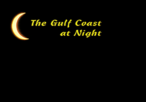
| 2DC 1365 | 1989-1990 |  |
 |
Etwas später wurde mind. für einen weiten Ort eine Karte in Devon veröffentlicht.
Die Schriftart ist weiterhin "ITC Souvenir", aber nicht mehr so fett und etwas größer ("N" 4,1 mm statt 3,7 mm).
Auf der Adressseute ist eine Linie weniger eingedruckt - vermutlich um Platz für den Zielcode zu haben.
Daher ist die Karte auch nicht aus dem fortlaufenden Nummernkreis.
/
Somewhat later, a card was published for at least one wide place in Devon.
The font is still "ITC Souvenir", but no longer as bold and slightly larger (“N” 4.1 mm instead of 3.7 mm).
There is one less line printed on the address line - probably to make room for the destination code.
This is why the card is not from the consecutive number range.
|
|||||||||||||||||
| 2US SD 42, 2US ME 89, 2US ME 91 |
1988-1990 |   |
  |
In den USA wurde der Text nur zum Teil auf das dort übliche "at Night" geändert. /
In the US, the text has been changed only partly to the usual "at Night".
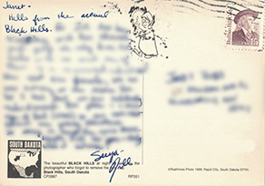
Die Karte von "Black Hills" von 1988 hat "ITC Souvenir" in gleicher Größe wie die Karten aus England,
während die Karten aus Bar Harbor und Kennebunkport den Text etwas größer gesetzt haben haben.
Bei allen ist auf der Rückseite auch der Schlafwandler abgebildet.
/
The card from "Black Hills" from 1988 has "ITC Souvenir" in the same font size as the cards from England,
while the cards from Bar Harbor and Kennebunkport uses this font a little larger.
All have the sleepwalker on the backside.
 Die für USA von John Hinde hergestellte Karten nutzten die 1987 ausgelaufene Trademark "Plastichrome" zur Angabe des Herstellungsverfahrens.
/
The cards manufactured for the US by John Hinde used the trademark "Plastichrome", which expired in 1987, to indicate the manufacturing process.
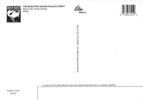
Die Karte für "Black Hills" wurde für den Verlag "Rushmore Photo" zuerst bei John Hinde, später in zwei Versionen bei Color Press/Maracom hergestellt,
wobei nur die Schriftart auf der Vorderseite zu "ITC Korinna" verändert wurde, die Rückseite bei der ersten jedoch fast identisch gelassen wurde - inkl. dem Schlafwandler:
/
The card for "Black Hills" was produced for the publisher "Rushmore Photo" initially by John Hinde, later in two versions by Color Press/Maracom,
where only he font on the front was modified to "ITC Korinna", while the back side was kept for the first one nearly identically - incl. the sleepwalker.
Die für USA von John Hinde hergestellte Karten nutzten die 1987 ausgelaufene Trademark "Plastichrome" zur Angabe des Herstellungsverfahrens.
/
The cards manufactured for the US by John Hinde used the trademark "Plastichrome", which expired in 1987, to indicate the manufacturing process.
Die Karte für "Black Hills" wurde für den Verlag "Rushmore Photo" zuerst bei John Hinde, später in zwei Versionen bei Color Press/Maracom hergestellt,
wobei nur die Schriftart auf der Vorderseite zu "ITC Korinna" verändert wurde, die Rückseite bei der ersten jedoch fast identisch gelassen wurde - inkl. dem Schlafwandler:
/
The card for "Black Hills" was produced for the publisher "Rushmore Photo" initially by John Hinde, later in two versions by Color Press/Maracom,
where only he font on the front was modified to "ITC Korinna", while the back side was kept for the first one nearly identically - incl. the sleepwalker.


|
|||||||||||||||||
| 2US LA 133, 2US FL 1089 |
~1988-1990 |   |
  |
Bei weiteren Karten in den USA wurde der Schlafwandler auf der Rückseite nicht mehr verwendet,
aber "ITC Souvenir" für den Text auf der Vorderseite - in beiden Schriftgrößen.
/
For further cards in the US the sleepwalker was no longer used on the backside, but the font "ITC Souvenir" for the text on the front - in both font sizes.
|
|||||||||||||||||
| 3US NC 134 | ~1989-1995 |  |
 |
In USA ist das Kleinformat (14 x 9cm / 5.5" x 3.5") verbreitet. Karten dieser Größe bekamen Nummern mit "3US" vorne.
Dieses Design hat wieder eine etwas größere "ITC Souvenir.
/
In USA, the small format (14 x 9cm / 5.5" x 3.5") is common. Cards of this size got numbers with "3US" in front.
This design again has a slightly larger "ITC Souvenir" font.
|
|||||||||||||||||
| 2DC 1359, 2OX 26 |
~1989 | 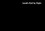 |
 |
Für weitere Städte in England (Land's End in Cornwall "DC", und Oxford "OX") wurde auch der größerer Font verwendet - nun oben rechts.
/
For other cities in England (Land's End in Cornwall "DC", and Oxford "OX") also the slightly larger font was used - now in the upper right corner.
|
|||||||||||||||||
| 2US MA 198, 2US MA 202, 2US MA 231 |
~1987-1989 | 
 |
 |
Für Karten in Massachusetts wurde der Text in "ITC Souvenir" in gelb gesetzt.
/
For cards in Massachusetts the text was set in yellow "ITC Souvenir"
Die Karte von Cape Cod wurde über "South Cape Distributors" vertrieben. Dieser hat die fast gleiche Karte auch von H.S. Crocker herstellen lassen, wobei der Text "ITC Souvenir" fett kursiv gesetzt wurde. / The card from Cape Code ws distrubuted locally by "South Cape Distributors". For them an almost same card was printed from H.S. Crocker, where the text uses "ITC Souvenir" in bold italic. 
In Massachusetts war der Verlag "Klein Post Card Service" stark vertreten, der Karten mit gelbem Text verwendete (bei Dexter und Kina in "Century Old Style", bei Color Press in "Times"). Dass John Hinde die Karten dort ebenfalls für unterschiedliche Verlage und Distributoren in gelb statt wie sonst in weiß herstellte, ist daher sicher kein Zufall. / In Massachusetts, the publisher "Klein Post Card Service" had a strong presence, using cards with yellow text (from Dexter or Kina in "Century Old Style", from Color Press in "Times"). The fact that John Hinde also produced the cards there for various publishers and distributors in yellow instead of white as usual is therefore surely no coincidence. 
|
|||||||||||||||||
| - | 2US MA 197, 2US MA 225, 2US MA 278, 2US ME 87, 2US ME 88, 2US RI 45, 2US TN 141 |
~1987 - 1990 |
In den USA wurden analog zum schwarzen "at Night" Design #1 auch graue "in the Fog" Karten herausgebracht.
Bemerkenswert ist, dass die erste "in the Fog" von Cape Cod (mit gelbem Text) gleichzeitig mit der entsprechenden "at Night" Karte veröffentlicht wurde, mit der Nummer davor.
Also hat John Hinde zuerst "in the Fog" und dann "at Night" veröffentlicht.
/
In the US, gray "in the Fog" cards were also released, analogous to the black "at Night" design #1.
Remarkably, the first "in the Fog" from Cape Cod (with yellow text) was released at the same time as the corresponding "at Night" card, with the number before it.
So John Hinde published "in the Fog" first and then "at Night".


Genauso wie schwarze Karten nachgemacht wurden, oder Designs für einen Distributor von unterschiedlichen Herstellern produziert wurde, ist dies auch bei den grauen Karten geschehen, die z.B. für "South Cape Distributors" nicht nur von "John Hinde" s.o., sondern auch von "dynacolor graphics" hergestellt wurde: / Just as black cards were imitated, or designs for one distributor were produced by different manufacturers, this also happened with the gray cards, which e.g. were produced for "South Cape Distributors" not only by "John Hinde" see above, but also by "dynacolor graphics": 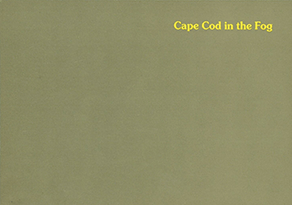
|
||||||||||||||||||
| - | 2/709 | ~1987 - 1989 |
Für Dublin gab es eine graue "Dublin in the Smog". / For Dublin exists a grey card "Dublin in the Smog"


|
||||||||||||||||||
| - | 2US AK 133 | ~1987 - 1990 |
Da der Text eine andere Bedeutung hat als "bei Nacht", ist diese schwarze Karte "Alaska Wintertime Fun" leider auch nicht akzeptiert.
Sie wurde von "J & H Sales" als "another Alaska Joe Original" mit interner Nummer "AG 26A" in etwa in gleicher Zeit veröffentlicht. /
Since the text has a different meaning than "at night", this black card "Alaska Wintertime Fun" is unfortunately also not accepted.
It was published by "J & H Sales" as "another Alaska Joe Original" with the internal number "AG 26A" at around the same time.


|
||||||||||||||||||
| - | 2US AK 425 | ~1975 - 2025 |
Schon vorher gab es eine weiße Karte "Polar Bears making love in a snow storm!" in mind. drei Varianten (als "Curteichcolor", ohne Hinweise, und als "Plastichrome"),
die ebenfalls von "J & H Sales" als "another Alaska Joe Original" veröffentlich wurden (mit interner Nummer "AN-10A").
Die beiden letzten Karten aus den 1970er/1980er Jahren haben die gleichen Bären-Zeichnungen wie die schwarze "Alaska Wintertime Fun"./
Even before that, there was a white card titled "Polar Bears Making Love in a Snowstorm!" in at least three versions (as "Curteichcolor", without any indication, and as "Plastichrome"),
which were also released by "J & H Sales" as "another Alaska Joe Original" (with internal number "AN-10A").
The last two cards from the 1970/80s use the same bear illustrations as the black "Alaska Wintertime Fun".


Von John Hinde ist dann eine modernere Variante erstellt worden ("2US AK 425"), die es mit gleicher Zeichnung anscheinend bis heute gibt, sich also über 50 Jahre gehalten hat. / John Hinde then created a more modern version ("2US AK 425"), which apparently still exists today with the same design, meaning it has remained in use for over 50 years. 

|
||||||||||||||||||
| #2 | 2DS 400, 2DS 401 | ~1988 |   |
 |
Als Schriftart wurde wieder die "ITC Souvenir" verwendet. / As font again "ITC Souvenir" was used.
Don's Supplies hat seit Anfang der 1980er Jahre Postkarten bei John Hinde drucken lassen. Nummern 2DS 10 bis 2DS 151 sind mir für normale Ansichtskarten bekannt. 300er-Nummern wurden für Tierpostkarten genutzt. Die 400er für "bei Nacht" Karten, wobei unbekannt wie viele verschiedene veröffentlicht wurden. / Don's Supplies has had postcards printed by John Hinde since the early 1980s. I am aware of numbers 2DS 10 to 2DS 151 for normal picture postcards. Numbers in the 300s were used for animal postcards. Numbers in the 400s were used for the "by night" cards, although it is unknown how many different ones were published. |
||||||||||||||||
| #3 | 2US OH 128, 2US CO 560, 2US WA 129, 2US NY 297, 2US CA 676, 2US ME 132, 2US ME 130, 2US MT 101, 2US WY 96, 2US RI 46, 2US FL 1302, 2US FL 1303, 2US TN 140, 2US TN 139, 2US AZ 664, 2US AZ 731, 2US AZ 732, 2US MS 104, 2US FL 1668, 2US AZ 852, 2US AZ 850, 2US CA 929 |
~1989-1995 |  |
  |
Mit strahlendem abnehmenden Mond oben links gabe es viele Karten von John Hinde.
/
With a shining descending moon on the top left there were many cards issued from John Hinde.
siehe Übersicht / see overview In den USA wurde dieses Design für viele Verlage und Distributoren hergestellt mit verschiedenen Schriftarten und Positionierungen des Textes: / In the USA, this design was produced for many publishers and distributors with different fonts and positioning of the text: Commercial Script (8x):
 ITC Souvenir (5x):
 Garamond (4x):
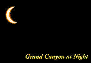 Andere Schriftarten / other fonts:
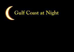

Spätere Ausgaben sind mit © "John Hinde Curteich" versehen. / Later editions are marked © "John Hinde Curteich". Der Verlag "Mostly Postcards" hat die Karte für Phoenix identisch bei einer anderen Druckerei erneut herstellen lassen - ohne Hinweis auf John Hinde. Der Mond wurde in diesem Fall neu erstellt./ The publisher "Mostly Postcards" re-issued the card for Phoenix identically later again - without mentioning John Hinde. The moon was re-created in this case. 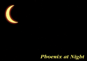

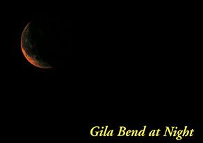
Für Gila Bend hat "Mostly Postcards" zuerst eine Karte mit kopiertem Mond von John Hinde bei einer anderen Druckerei hergestellt. Später (vermutlich um keine Copyright-Probleme zu bekommen) hat der Verlag die Karte unter gleicher Nummer mit eigenem Mond-Foto wiederveröffentlicht. / For Gila Bend, "Mostly Postcards" issued initially a card with copied moon from John Hinde, printed somewhere else. Later (probably to avoid copyright problems), the publisher has reissued the card with same number with its own moon photo. 
|
||||||||||||||||
| JHPI 52, JHPI 56 |
~1990 |  |
 |
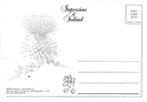
Karten mit diesem Design wurden für Dublin und Irland in einem extra großen Format hergestellt, wie ich es nur aus Irland kenne.
Serie "Photographic Impressions". (Nr. JHPI steht vermutlich für John Hinde Photographic Impressions.)
/
Cards with this design for Dublin and Ireland were produced in an extra large format, like I know it only from Ireland.
Photographic Impressions series. (No. JHPI probably stands for John Hinde Photographic Impressions.)
Als Schriftart wurde nun "Times" verwendet. / Font "Times" was used here.
Für London hat "Kardorama" die Karte herausgebracht, die bei John Hinde produziert wurde - ohne jedoch die sonst übliche Nummer mit aufzudrucken. Kardorama, ein Verlag für Humor-, Royal-, und London-Postkarten, trat früher auch als Distributor von John Hinde-Postkarten auf: / For London, "Kardorama" published the card, which was produced by John Hinde - but without the usual number printed on it. Kardorama, a publisher of humor, Royal, and London postcards, also used to act as a distributor of John Hinde postcards: 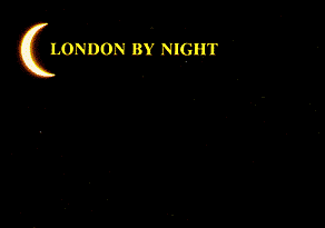
|
|||||||||||||||||
| 2NI 152 | ~1990- 1999 |  |
  |
Für Nordirland ("NI") wurde die Karte in normaler Größe mit einer leider nicht identifizierten Serifen-Schrift herausgegeben.
Mindestens diese Karte ist noch viele Jahre hergestellt worden, dann auch mit dem in den 1990er Jahren verwendeten neuen "John Hinde Original" Logo.
/
For Northern Ireland ("NI"), the card was issued in normal size using an non-identified font.
At least this card has been produced for many more years, then also with the new "John Hinde Original" logo used in the 1990s.
|
|||||||||||||||||
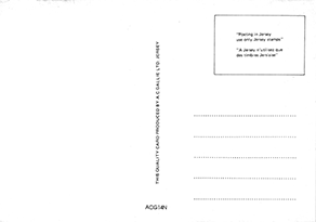
| 2J 78, 2SC 342, 2BDA 124 |
~1990-1991 |    |
   |
Für Jersey ("J"), Schottland ("SC") und Bermuda ("BDA") wurde dieses Design mit anderen Schriftarten ("Times", "Springfield", "Kaufmann") und Positionen hergestellt und vertrieben.
Für Schottland wurde die Karte über "Innes & Cromb Ltd." vertrieben, für Bermuda über "Tropic Traders, Ltd.".
/
For Jersey ("J"), Scotland ("SC") and Bermuda ("BDA") this design was produced and distributed with other fonts ("Times", "Springfield", "Kaufmann") and positions.
For Scotland, the card was distributed by "Innes & Cromb Ltd.", for Bermuda by "Tropic Traders, Ltd.
Für Madeira (wo John Hinde nicht aktiv war) hat der Konkurrent "FISA" das Design mit dem strahlenden Mond kopiert; für Jersey der lokale Verlag "A.C.Gallie". / For Madeira (where John Hinde was not active), the competitor "FISA" copied the design with the shining moon; for Jersey, the local publisher "A.C.Gallie". 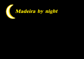

|
- | 2US AZ 851 | ~1990-1995 |
Mindestens in einem Fall wurde eine weiße "in Winter" Karte veröffentlicht, die zeitgleich mit der "at Night"-Variante (in Design #3) erschien. /
At least in one case also a white "in Winter" card was created, which was issued together with the "at Night" version (in design #3).

|
|||||||||||||
| #4 | 2US SD 105, 2US ME 85, 2US PA 240 |
~1990 |    |
   |
Für die USA gab es ein paar Karten ähnlich zu Design #2 aber mit abnehmenden strahlendem Mond und weißem Text in "ITC Souvenir".
/
For the USA a few cards exist similar to #2 with the descreasing shining moon and white text in "ITC Souvenir".
Die Karten von Black Hills und York Beach entsprechen den beiden bei Design #1 verwendeten Schriftgrößen und haben auch wieder den Schlafwandler. The cards from Black Hills and York Beach match the two font sizes used in Design #1 and also have the sleepwalker again. Eine zweite Neuauflage von Black Hills hat der Verlag "Rushmore Photo" dann nicht mehr bei John Hinde, sondern bei Kaye's Printing herstellen lassen und wieder nur die Schriftart verändert, den Mond aber kopiert:/ The publisher "Rushmore Photo" had a second new edition of Black Hills produced by Kaye's Printing instead of John Hinde, and again only the typeface was changed, but the moon was copied: 
|
||||||||||||||||
| #5 | SCIM 6 | ~1991 | 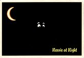 |
 |
Einzellayout mit strahlendem Mond, Augen und weißem Rand. Serie "Impressions of Scotland" (Nr. SCIM vermutlich Scotland Impressions) im Großformat.
Neben dem Mond von Design #3 und #4 wurde die gleiche Schriftart "Brody" wie bei Jersey verwendet, eine ähnliche Rückseite wie bei Irland und der gleiche Distributor wie bei Schottland.
/
Single layout with shiny moon, eyes and white border. Series "Impressions of Scotland" (No. SCIM presumably Scotland Impressions) in large format.
Besides the moon of designs #3 and #4, the same font "Brody" as for Jersey was used, a similar reverse as for Ireland and the same distributor as for Scotland.
|
||||||||||||||||
| #6 | 2US MT 55 | ~1990 |  |
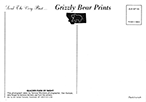 |
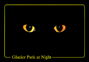
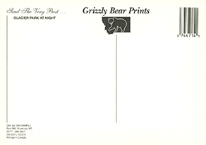
Einzelstück in Schreibschrift "Kaufmann" (wieder mit den Hinweisen "Plastichrome" und "Printed in Ireland") für bzw. von "Dan Sample Postcards" mit einem lustigen Hinweis zum "Foto":
/
Single piece in script font "Kaufmann" (again with the notes "Plastichrome" and "Printed in Ireland") for or by "Dan Sample Postcards" with a funny note about the "photo":
"Dan Sample Postcards" brachte später neue "Glacier Park at Night" Karten von anderen Herstellern heraus./ "Dan Sample Postcards" reissued "Glacier Part at Night" cards later from other manufacturers. 

|
||||||||||||||||
| #7 | 3US DC 91 | ~1991 |  |
 |
Weiteres Einzeldesign, diesmal wieder in "ITC Souvenir" und im Kleinformat (5.5" x 3.5"), für die "Capsco, Inc." hergestellt.
Außer der Nummer gibt es keinen Hinweis auf John Hinde.
/
Another single design, this time again in "ITC Souvenir" and small format (5.5" x 3.5") made for the "Capsco, Inc.".
Except for the number there is not hint to John Hinde.
|
||||||||||||||||
| - | 3US DC 90, 3US CT 26, 3US CA 908 |
~1990 - 1993 |
Später wurden auch graue "in the Fog" und "A Foggy Day" Karten mit anderem Design herausgebracht, im Kleinformat "3US"....
/
Later also grey "in the Fog" and "A Foggy Day" cards were issued with other designs, in small format "3US"....
|
||||||||||||||||||
| - | 2US OH 127, 2US MS 118, 2US LA 138, 2US TN 230 |
~1990 - 1993 |
... und Normalformat, z.T. als Neuauflagen (Z.B. Great Smokey Mountains, mit neuer Nummer) /
and in normal format, partly as re-issues (E.g. Great Smokey Mountains, with new number)

|
||||||||||||||||||
| - | NB40 | ~1990 - 1993 |
Ohne typische Nummer von John Hinde, aber explizit als "©John Hinde Curteich Inc." angegeben wurde für Distibutor "Benjamin News Inc." diese zum Teil zweisprachige Karte herausgebracht./
Without typical number from John Hinde, but explizitly mentioned as "©John Hinde Curteich Inc." this partly bi-lingual card was issued for Distibutor "Benjamin News Inc.".
diese zum Teil zweisprachige Karte herausgebracht./


|
||||||||||||||||||
| #8 | 3US OH 254 | ~1991 |  |
 |
Weiteres Einzeldesign im Kleinformat wurde mit Schriftart "ITC Benguiat" für die "Ohio Caverns" hergestellt - hier mit Angabe "John Hinde Curteich, Inc. ©".
/
Another single design in small format was made using font "ITC Benguiat" for the "Ohio Caverns" - here with indication "John Hinde Curteich, Inc. ©".
|
||||||||||||||||
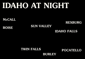
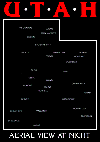
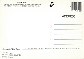
| #9 | 2US UT 162 | ~1991 | 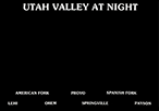 |
 |
Weiteres Einzeldesign diesmal wieder in "ITC Souvenir" wurde für "Great Mountain West Supply" veröffentlicht, die später alle weiteren, z.T. ähnlichen Karten in Südkorea drucken ließen.
/
Another single design again using font "ITC Souvenir" was printed for "Great Mountain West Supply". Later cards (sometimes similar) were printed in South Korea.
|
||||||||||||||||
| #10 | 2US SC 106 | 1991 |  |
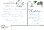 |
Einzeldesign in Schriftart "ITC Caslon No. 224" mit ©-Hinweis "Produced and Distributed by Brandon Adv. and Sales Co. Inc.".
/
Single design in Font "ITC Caslon No. 224" with © notice "Produced and Distributed by Brandon Adv. and Sales Co. Inc.".
|
||||||||||||||||
| - | ~1992 |  |
 |
Einzeldesign in "Commercial Script" von "GA Scenic South Co" mit Barcode von John Hinde.
Die Karte hat jedoch keine Nummer von John Hinde,
daher wurde eventuell nur die Rückseite inkl. Barcode von früheren Karten übernommen.
/
Single design using "Commercial Script" from "GA Scenic South Co" with barcode by John Hinde.
However, the card has no number by John Hinde,
so maybe only the back incl. barcode was taken over from earlier cards.
|
|||||||||||||||||
| #11 | 2US CO 572 | ~1993 |  |
 |
Für den Verlag "Flatiron Postcard Co." stellte John Hinde diese Karte her - Schriftart mal wieder "ITC Souvenir".
/
For the publisher "Flatiron Postcard Co." John Hinde produced this card - again the font was "ITC Souvenir.
Andere Karten mit diesem Design in minimal anderer Ausführung ließ der Verlag in den USA bei Maracom drucken (CP8088, CP8089, CP8091). Da die Verlagsnummer der Karte von Denver um ein "A" ergänzt wurde, könnte es eine Wiederauflage sein, die diesmal bei John Hinde gedruckt wurde. / Other cards with this design in tiny different realization were printed for this publisher in the USA by Maracom (CP8088, CP8089, CP8091). As the publisher number of the Denver card was added with an "A" it is possible that it is a re-print, this time from John Hinde. 


|
||||||||||||||||
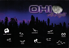
| #12 | 2US UT 227 | ~1991 |  |
 |
Wie viele andere Verlage, die "Wildlife" oder "Nightlife"-Karten herausgaben, hatte auch John Hinde zwei Designs im Angebot (Schriftart "Hobo").
Akzeptiert ist dieses "Night Creatures" Design von Death Valley.
/
Like many other publishers who issued "Wildlife" or "Nightlife" cards, John Hinde had two designs on offer (font "Hobo"). Accepted is this "Night Creatures" design from Death Valley. |
||||||||||||||||
| - | 2CG 225 | ~1991 |
Nicht akzeptiert ist die generische "Night Creatures" Version "2CG 225" ("CG" für California Greeting/General.)
Ähnlich gab es auch für Florida neben dem "2US FL xxx" die "2FG xxx" für generische Karten ohne Ortsnamen.
/
Not accepted is this generic "Night Creatures" version "2CG 225" ("CG" for California Greeting/General). There was also a similar "2FG xxx" numbering for Florida cards without a location name - in addition to the "2US FL xxx" numbering. 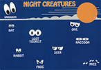
|
||||||||||||||||||
| #13 | 2US FL 1865 | ~1991-1995 | 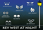 |
 |
Ein anderes Design mit Augen wurde in verschiedenen Variationen für unterschiedliche Verlage hergestellt.
/ Another design with eyes was produced in several variations for different publishers.
Die erste Karte mit Schriftart "Lithos" von Key West enthält die Hinweise "Photo © Charm Kraft Ind. Inc." (Gestaltung), "Florida Keys Gift & Souvenirs" (Distributor) und "John Hinde Curteich Inc. Printed in Ireland" (Druckerei).
/
The first card with font "Lithos" from Key West has the notations "Photo © Charm Kraft Ind. Inc." (Design), "Florida Keys Gift & Souvenirs" (Distributor) and "John Hinde Curteich Inc. Printed in Ireland" (Printer).
|
||||||||||||||||
| 2US DC 162, 2US MD 170 |
~1991-1995 | 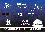 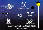 |
 |
 Für Baltimore und Washington DC wurden für "D. Traub & Son" Karten mit diesem Design hergestellt, auf denen oben linke eine roten US-Flagge ergänzt wurde.
/
For Baltimore and Washington DC, cards with this design were produced for "D. Traub & Son", on which a red US flag was added at the top left.
Beide wieder mit Schriftart "Lithos". / Both again with font "Lithos".
Für Baltimore und Washington DC wurden für "D. Traub & Son" Karten mit diesem Design hergestellt, auf denen oben linke eine roten US-Flagge ergänzt wurde.
/
For Baltimore and Washington DC, cards with this design were produced for "D. Traub & Son", on which a red US flag was added at the top left.
Beide wieder mit Schriftart "Lithos". / Both again with font "Lithos".
|
|||||||||||||||||
| 2US PA 387 | ~1991-1995 | 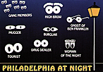 |
 |
Komplett eigenes Design (mit Hinweis "Art © John Hinde Curteich Inc.") wurde für die "Phila. Post Card Co." hergestellt,
wobei die Laterne leicht anders gemalt wurde und als Schriftart wieder "Hobo" verwendet wurde.
/
Completely own design (with note "Art © John Hinde Curteich Inc.") was produced for the "Phila. Post Card Co.",
with the lantern painted slightly differently and the font was again "Hobo".
|
|||||||||||||||||
| #14 | JJ-19016 2USFL-2096 2MWFL-JJ-19016 |
~1995-2010 |  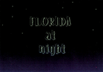 |
   |
Seminole Souvenirs hatte zuvor dieses Design in drei Versionen (einmal "ITC Bookman", zweimal "ITC Souvenir") mit weißem Rand schon bei einer anderen Druckerei
(später als Lawson Mardon namentlich auf einer Karte angegeben) in USA herstellen lassen
- einmal in gleicher Normalgröße ("JJ19016"), einmal im Großformat ("FS0016"):
/
Seminole Souvenirs had previously had this design produced in three versions (one in "ITC Bookman", two in "ITC Souvenir") with white border by another printer in the USA
(later mentioned explicitly as Lawson Mardon)
- once in the same normal size ("JJ19016"), once in large format ("FS0016"):
Von John Hinde wurden drei Neuauflagen erststellt: / From John Hinde the card was re-issued three times:
Die erste ohne weißem Rand, aber weiterhin in "ITC Souvenir" mit der Hersteller-Nummer "JJ-19016". /
The first without white border, but still in "ITC Souvenir" and the publisher number "JJ-19016".
Die zweite mit dem typischen Nummernformat von John Hinde ("2USFL-2096") und einer geänderten Vorderseite (Schriftart "Alleycat") und einer verzierten Rückseite. /
The second with the typical number format from John Hinde ("2USFL-2096") and a changed front (font "Alleycat") and a decoraded back side.
Die dritte Karte hat wieder die Vorderseite der ersten Karte - mit einem neues Format für die Nummer: "2MWFL-JJ-19016". /
The third card gat again with the front of the first card - with a new format for the number: "2MWFL-JJ-19016".
|
||||||||||||||||
| - | 2MT 69 | ~1995 | Bei der Karte für Montéal fehlt leider ein "bei Nacht", um in meiner Sammlung akzeptiert zu werden.
/
On the card from Montéal the "at night" is missing to be accepted in my collection.

|
||||||||||||||||||
| #15 | 2BH 305 | ~2000 |  |
 |
Einzeldesign für die Bahamas ("BH"), das über "Island Merchant Ltd." in Nassau vertrieben wurde. Schriftart ist eine klassische Serifenlose, vermutlich "Futura".
/
Single design for the Bahamas ("BH"), which was distributed via "Island Merchant Ltd." in Nassau. Font is a classic sans-serif, probably "Futura".
|
||||||||||||||||
| #16 | 2US MI 670 | ~2015 | 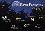 |
 |
Für den Verlag "Penrod/Hiawatha" wurde diese Karte hergestellt. Die beiden Schriftarten sind nicht genau klar. "UPPER PENINSULA" ähnelt stark "Art Department JNL".
/
This card was made for the publisher "Penrod/Hiawatha". Both used fonts are not clearly identified. "UPPER PENINSULA" is very close to the font "Art Department JNL".
Wie bei modernen Postkarten aus den 2010er Jahren ist auch die Rückseite farbig blass bedruckt. Penrod/Hiawatha hatte ähnliche Karten schon bei anderen Druckereien (u.a. "Charm Kraft Ind. Inc", die schon das Design #13 erstellten) herstellen lassen: / As with modern postcards from the 2010s, the back is also printed in pale color. Penrod/Hiawatha had already had similar cards produced by other printers (incl. "Charm Kraft Ind. Inc" which created already the design #13): 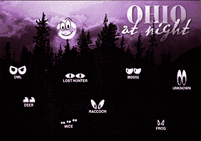
|


John Hinde Curteich / Plastichrome in USA
| 2US |  |
Night | xxx | |
| 2US |  |
Fog | xxx | |
| 2US AK 133 | |
Fog | J & H Sales, "another Alaska Joe Original" AG 26A |
|
| 2US AK 425 | |
Fog | J & H Sales, "another Alaska Joe Original" AN-10A |
|
| 2US AZ 851 | |
Flagstaff in Winter | Mostly Postcards | |
| 3US CA 908 |  |
A Foggy Day in San Francisco | Woodhams & Associates & Woddhams Enterprises | auch von/ also from "Mike Roberts" (C37707), Woodhams & Associates |
| 2CG 225 | 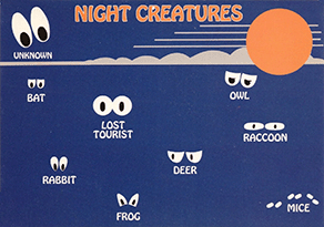 |
NIGHT CREATURES | - | |
| 2US CO 572 | |
Denver at Night | Flatiron Postcard Co | |
| 3US CT 26 |  |
Mystic in the Fog | Book & Tackie | |
| 3US DC 90 |  |
Washington, D.C. in the Fog | Capsco, Inc., "A Capsco Product" |
|
| 3US DC 91 | |
Washington, D.C. at Night | Capsco, Inc., "A Capsco Product" |
|
| 2US DC 162 | |
WASHINGTON D.C. AT NIGHT | Traub & Son | |
| 2US FL 1089 | |
St. Petersburg at Night | Sun Coast Post Cards | |
| 2US FL 1865 | |
KEY WEST AT NIGHT | Florida Key Gifts & Souvenirs | |
| 2USFL-2096 | |
FLORIDA at night | Seminole Souvenirs | |
| 2MWFL-JJ-19016 | |
Florida at Night | Seminole Souvenirs | |
| 2US LA 133 | |
Bourbon Street at Night | Express Publishing Co | |
| 2US LA 138 | |
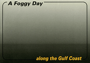
A Foggy Day along the Gulf Coast | Ocean Springs Dist. | |
| 2US MA 197 | |
Cape Cod in the Fog | South Cape Distributors | auch von/ also from "Dynacolor graphics" (P72178), South Cape Distributors |
| 2US MA 198 | |
Cape Cod at Night | South Cape Distributors | auch von/ also from "Dynacolor Graphics" (P79511), South Cape Distributors |
| 2US MA 198 |  |
Cape Cod at Night | South Cape Distributors | |
| 2US MA 202 | |
Boston at Night | Arts & Cards | |
| 2US MA 225 | |
Boston in the Fog | Arts & Cards | |
| 2US MA 231 |  |
Marthas Vineyard at Night | South Cape Distributors | |
| 2US MA 278 | |
Rockport in the Fog | Costal Color Products, "A Massachusetts Print" |
|
| 2US MD 170 | |
BALTIMORE, MARYLAND AT NIGHT | Traub & Son | |
| 2US ME 87 | |
Boothbay Harbor in the Fog | Costal Color Products, "A Maine Print", M-3146 |
|
| 2US ME 88 | |
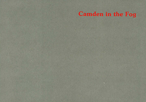
Camden in the Fog | Coastal Color Products, "A Maine Print", M-3147 |
|
| 2US ME 89 |  |
Bar Harbor at Night | Coastal Color Products | |
| 2US ME 91 | |
Kennebunkport at Night | Coastal Color Products | |
| 2US MS 118 | |
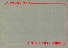
A Foggy Day on the Mississippi | Distr. Express Publishing | |
| 2US MT 55 | |
Glacier Park by Night | Dan Sample Postcards, "Grizzly Bear Prints" |
|
| 3US NC 134 | |
Outer Banks at Night | Elizabeth City News Co. & Albemarle News Co |
|
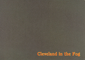
| 2US OH 127 | |
Cleveland in the Fog | Crown Greetings Inc. | |
| 3US OH 254 | |
Total Darkness Ohio Caverns | Ohio Caverns | |
| 2US PA 387 | |
PHILADELPHIA AT NIGHT | Philadelphia Post Card Co, 99-NC |
|
| 2US RI 45 | |
Newport in the Fog | South Cape Distributors | |
| 2US SC 106 | |
Holden Beach at Night | Brandon Advertising & Sales Co | |
| 2US SD 42 | |
Black Hills by Night | Rushmore Photo & Gifts, RP351 | auch 2x von/ also from "Color Press / Maracom" (CP2887) Rushmore Photo & Gifts (RP351)   |
| 2US SD 105 | |
Black Hills by Night | Rushmore Photo & Gifts, RP351 | auch von/ also from "Kaye's Printing" (K20213) Rushmore Photo & Gifts (RP351)  |
| 2US TN 141 | |
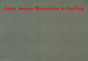
Great Smokey Mountains in the Fog | Souvenirs of Smokies, GSM-622 |
|
| 2US TN 230 | |
Great Smokey Mountains in the Fog | Souvenirs of the Smokies, GSM-622 |
2US UT 162 | |
UTAH VALLEY AT NIGHT | Great Mountain West Supply, "Mountain West Prints" MWP-U41 |
2US UT 227 | |
NIGHT CREATURES Death Valley | Blackner Card and Souvenir, "Best of the West Prints" |